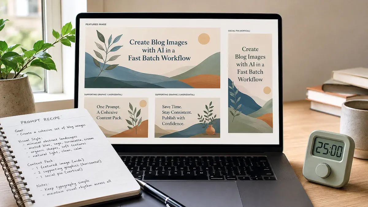
How to Create Images for Blog Posts with AI in About 20 Minutes

Here’s a belief that’s quietly costing you time: you need a design subscription, a good eye for aesthetics, and an hour of prompt tweaking to make your blog posts look professional. That belief is wrong, and holding onto it is exactly why so many side-hustlers either skip visuals altogether or burn an entire evening chasing the “right” AI output.
If you’ve generated an image that came back glossy, plastic-looking, or just slightly off, you already know that frustration. The render looks like an AI made it, and that hurts the credibility you’re trying to build. Learning how to create images for blog posts isn’t about becoming a designer. It’s about building one repeatable, roughly 20-minute batch system you run the same way every time.
That’s what this workflow gives you: a set of style recipes that avoid the fake AI look, a batch-generation process handled mainly inside Wealthy Affiliate’s ImageStudio, followed by a quick optimization step before publishing, and a pre-publish checklist so nothing you post slows your site down.
TL;DR: How to Create Images for Blog Posts
The Four-Graphic Rule: What Every Blog Post Actually Needs
My practical default is a four-graphic pack, but the number should always depend on what the post actually needs. A featured image sets the tone at the top of the post. Two in-post visuals, usually a diagram or a screenshot, explain whatever concept the section around them is covering. One social pin gives you something worth saving if a reader wants to come back to the post later.
That’s the whole list. Anything past it, the decorative stock photo of a coffee cup, a second variation of the same graphic, an image that exists because the section “felt empty,” is time spent on a task that isn’t moving the post forward. Before you generate a single image, ask whether it clarifies something the text alone can’t, or whether it’s just filling space.
This matters more than it sounds like it should. If you’re already only focusing on the essential tools when you’re building out an affiliate site, your image workflow should run on the same logic. Four purposeful graphics beat twelve decorative ones, and they take a fraction of the time.
How much of that four-graphic pack you actually build out depends on how much time you have to give it in a given week. If you’re working in short bursts between other commitments, the featured image and the two body visuals do the real work, and the social pin can wait. If you’ve got more room to spread the workflow across a session, adding the pin is a quick fourth step, not a separate project.
Setting Up Your Visual Style Recipes to Avoid the Fake AI Look
The reason most AI blog graphics look fake isn’t the tool. It’s the prompt. Default settings on most image generators lean toward glossy, over-rendered, slightly plastic output, and that’s the exact look that makes a reader’s brain flag “AI-generated” before they’ve even read your headline.
The fix is a small set of style descriptors you reuse every time, instead of writing a new prompt from scratch for every image. Flat vector illustration, minimalist line art, and isometric diagram all override the generator’s default toward photorealism and gloss. Once you lock in a recipe, you’re not designing anymore. You’re filling in a template.
Solid or transparent backgrounds do a second job here that’s easy to miss. They eliminate the weird halo borders and mismatched color casts that show up when a busy AI background collides with your site’s actual layout. A clean background means clean cropping, which means the image drops into your post without extra editing.
To keep the visual tone consistent across every asset in your post, keep the exact background color descriptor identical across all four prompts in your batch (for example, use “solid off-white background” every time rather than varying it to “solid background”).
The Flat Vector Style Recipe (Copy-Paste Prompt)
Use this as your baseline whenever you want an image that reads as a custom graphic asset rather than something rendered in ten seconds.
flat vector illustration, [subject], solid pastel background, minimal detail, clean line work, no gradients, no photorealism, no shadows
The Isometric Diagram Recipe (Copy-Paste Prompt)
This recipe works well for anything explaining a process, a workflow, or a system, since the isometric angle naturally suggests structure.
isometric diagram, [subject], solid background, simple geometric shapes, muted color palette, no gradients, no photorealistic textures
If you’re still getting glossy or distorted results after switching to one of these recipes, add a negative prompt to filter out the render styles causing the problem.
no gradients, no glossy textures, no 3D render, no photorealistic shading, no drop shadows, no stock photo style
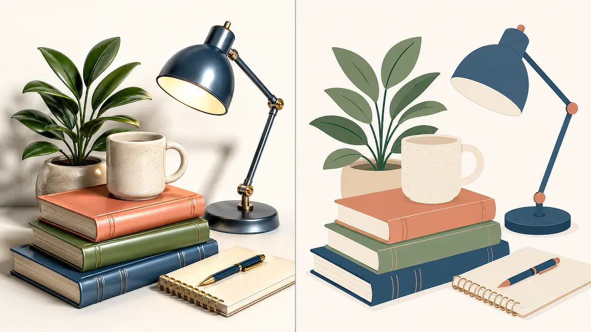
The tradeoff is worth naming honestly. Flat vector graphics are simpler than a fully rendered 3D image, and they will never look as visually rich. What you get in exchange is consistency. Every graphic on your site starts to look like it came from the same hand, which is exactly the impression a small, credible site needs to make.
Save both recipes somewhere you’ll actually find them again, a notes doc, a pinned Slack message, whatever you already check daily. The moment you have to reconstruct a prompt from memory, the whole point of a repeatable system is gone.
A Roughly 20-Minute Batch Workflow Using ImageStudio
Here’s where the four-graphic rule and the style recipes turn into an actual process. Batching only works if you generate everything in one sitting, using the same tool, instead of jumping between a generator, a cropping app, and a compression site for every single image.
The workflow breaks into four steps:
- Prompt selection (about 3 minutes): Pull your saved flat vector or isometric recipe and swap in the subject for this specific post.
- Batch generation (about 7 minutes): Run the featured image, both body visuals, and the pin back-to-back while the recipe is still fresh in the generator’s context.
- Aspect ratio conversion (about 5 minutes): Crop each output to its correct dimensions before you move on.
- Visual audit (about 5 minutes): Look at all four images together and cut anything that doesn’t clearly earn its place.
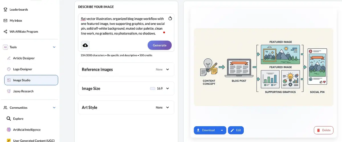
The reason this stays inside Wealthy Affiliate’s ImageStudio instead of spreading across three separate apps is momentum. Every tool switch is a small tax on your attention, and those taxes add up fast when you’re trying to protect a limited writing session. An integrated tool means your saved recipes, your generation, and your cropping all live in one place, so you’re not rebuilding your workflow from scratch every time you sit down.
This same logic applies past image generation, too. If you’re using AI to speed up your early business tasks, the win isn’t the AI itself. It’s picking tools that consolidate steps instead of adding more of them. Read my complete Wealthy Affiliate review to see how these tools fit together if you want the fuller picture of what’s included in the platform beyond ImageStudio.
Pre-Publish Image Optimization: Sizing, Compression, and Alt Text
Generating the graphics is only half the job. An unoptimized image, even a good one, can slow your page load enough to hurt both the reader experience and your search rankings. This step takes a few extra minutes, and it’s not optional.
Start with sizing. Your featured image should scale to roughly 1200 pixels wide, and your in-post visuals to roughly 800 pixels wide. Going bigger doesn’t improve how the image looks on the page. It just adds file weight your theme has to load for no visible benefit.
The table below breaks down the sizing and format targets by image role.
Image Role
Target Dimensions
Max File Size
Recommended Format
Featured Hero
1200 x 675 px
400 KB
WebP
In-Post Visual
800 x 450 px
200 KB
WebP
Social / Pinterest
1000 x 1500 px
300 KB
WebP
Featured Hero
Target Dimensions: 1200 x 675 px
Max File Size: 400 KB
Recommended Format: WebP
In-Post Visual
Target Dimensions: 800 x 450 px
Max File Size: 200 KB
Recommended Format: WebP
Social / Pinterest
Target Dimensions: 1000 x 1500 px
Max File Size: 300 KB
Recommended Format: WebP
Image Compression and Single-Tab Resizing with Squoosh
Once your images are generated, run them through Squoosh, a free browser-based compression tool built by Google Chrome Labs. You don’t need external design software like Photoshop or Canva to prep your files. Squoosh includes a built-in Resize module alongside its format converter, allowing you to scale pixel dimensions down to 1200px or 800px and convert your PNG outputs to WebP all inside a single browser tab. Converting PNGs to WebP typically drops file sizes by around 30 percent with no visible loss in sharpness.
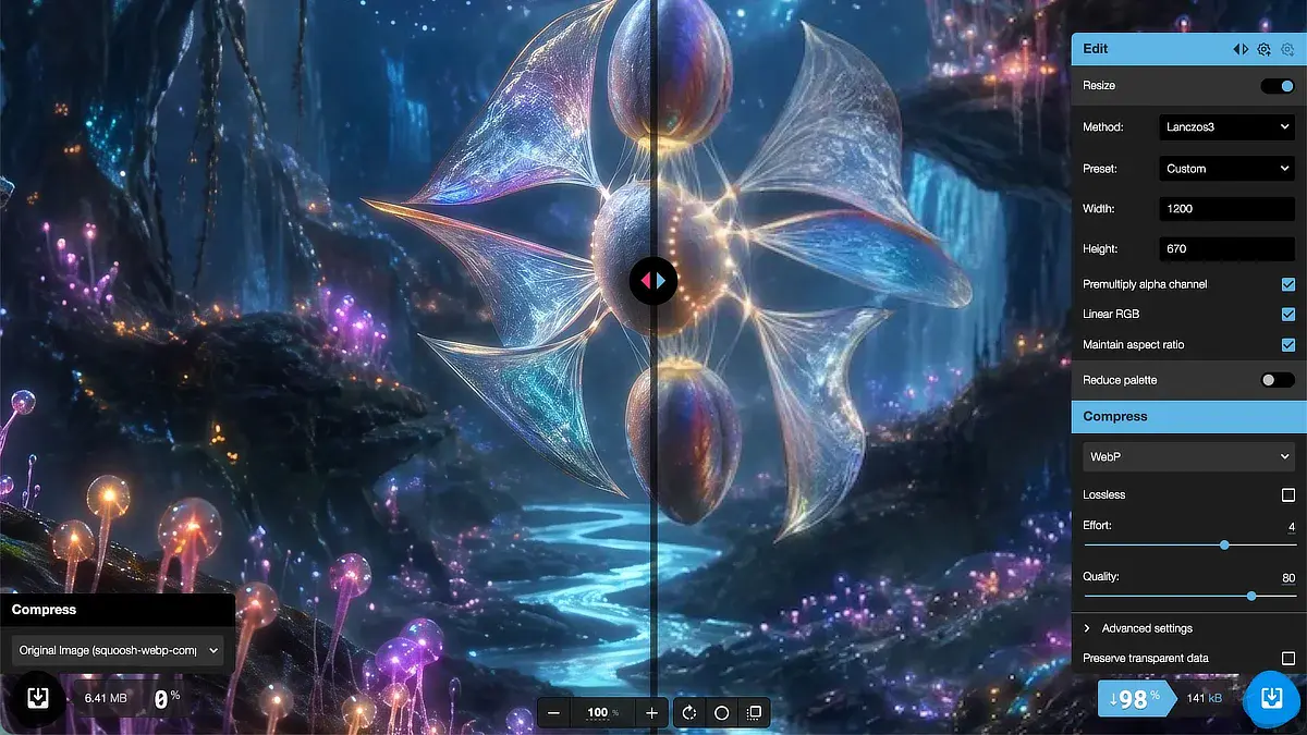
The reason WebP specifically matters, and not just “smaller is better,” is that it’s built for exactly this tradeoff. It compresses more aggressively than PNG or JPEG while preserving the clean edges that flat vector and isometric graphics depend on. A glossy photo can survive heavier compression without looking rough. A flat illustration with crisp lines can’t, so the format choice matters more here than it would for a typical photograph.
Writing Accessibility-First Alt Text
Alt text isn’t a box to check for SEO. It’s how a screen reader user experiences your image, and it should describe what the image actually shows, not stuff in your target keyword. “Isometric diagram comparing five affiliate marketing tools consolidated into one dashboard” tells a screen reader user something useful. “Best affiliate marketing tools guide” does not.
Keep W3C’s Web Accessibility Initiative guidance in mind as a baseline: alt text should be concise, specific, and written as if you’re describing the image to someone who can’t see it. If an image is purely decorative and adds no information, the correct alt text is an empty attribute, not a forced description.
One more thing worth checking before you upload: your theme’s content width. If your site renders body content at roughly 800 pixels wide, generating an 800-pixel image means it displays at full sharpness without your theme scaling it up or down. When you’re setting up your initial site layout, it’s worth confirming that width once so every image you generate afterward matches it by default.
Managing Your Side-Hustle Time: When to Expand or Trim Your Graphic Pack
Not every post needs the full four-graphic pack, and treating it as mandatory is how a batch system turns into a bottleneck. The right question isn’t “how many images should this post have.” It’s “how much time do I actually have this week, and where does image production rank against getting the post written and published at all.”
If your available time is tight, trim the pack down to the featured image and the two body visuals, and skip the social pin. A post with three solid, purposeful graphics and a published date beats a post with four graphics that’s still sitting in drafts because the pin took too long. If you have more room in a given week, add the pin as a quick fourth step rather than a separate task, since your recipes and backgrounds are already set up for it.
Writing quality and publishing consistency are the two things that actually build a site over time. Images support that goal. They don’t replace it. If you ever find yourself spending more time refining a prompt than you spent writing the section it’s illustrating, that’s the signal to simplify, not to keep tweaking.
Start your free Wealthy Affiliate Starter trial to test ImageStudio if you want to run this exact workflow yourself before you commit to anything. The four-graphic system, the style recipes, and the batch process all work the same way whether this is your first post or your fiftieth. Pick the version of the pack that fits the time you actually have this week, and build from there.
If you have questions about setting up prompt-style recipes, compressing WebP files, or choosing image dimensions for your site theme, leave a comment below. I read and answer every question.

Sonia Zannoni
Hi, I’m Sonia Zannoni, creator of Click to Prosper. I share practical tools, workflows, and honest guidance to help you build an online business with more clarity and less chaos.
About Sonia
Feeling stuck between too many tools and too much advice? Start with the beginner path.
View the Blueprint