How to Create Images for Blog Posts with AI That Match Your Site

Affiliate Disclosure: This post contains affiliate links. If you purchase through one of my links, I may earn a commission at no additional cost to you. Read the full Affiliate Disclosure for details.
You typed “no gradients, no glossy textures” into the prompt, and the image came back full of gradients and gloss. Now it’s sitting at the top of a post you worked hard on, looking like the default AI header you’ve seen on a hundred other sites.
That isn’t a design-skills problem. Most advice on how to create images for blog posts is a list of tools, and a new tool tends to hand you the same default look. The worry underneath is fair, too: a reader who lands on a glossy, generic header may decide the whole post was machine-made before they’ve read a word of it.
What you want is a repeatable way to make a featured image and a couple of in-post visuals that look like your site, without hiring a designer.
So here’s the workflow I use: one style recipe you write once and paste wherever you make images, which images to make and which to skip, the size to set first, what Wealthy Affiliate’s Artist does now and how its costs work, and the resize, compress and alt text steps that finish every image.
TL;DR: How to Create Images for Blog Posts
Decide Which Images Earn a Place Before You Make Any
Before I write a single prompt, I work out what each image in the post has to show. The default set is three images: a featured image and two in-post visuals. A Pinterest pin is the optional fourth, and on a tight week I make the three and leave the pin out.
An in-post image earns its spot when it shows something the text can’t, like a step, a comparison, or how two things relate. A picture that only decorates doesn’t, however nice it looks, because the reader scrolls straight past it and the page still has to load it.
The featured image has a different job. It sets the mood for the post, and it’s the first image that loads.
Here’s how that plays out on a post about picking a niche. The featured image sets the tone with one simple scene. The first in-post visual shows the three questions the post runs every niche idea through, and the second puts a broad niche beside a narrow one so the difference is visible at a glance.
The image I’d cut is someone frowning at a laptop, because it shows nothing the words haven’t already said.
If you do make the pin, make it in the same sitting from the same recipe, so it matches the rest of the post without any extra work. Getting it in front of people once it exists is a separate job, and that’s what a weekly pinning routine is for.
Deciding all this first matters because every image costs time, and in many tools it costs credits too. Planning the set up front keeps you from making extras just because the generator happens to be open.
Write One Style Recipe So Every Image Looks Like Your Site
Google’s prompt guide for its Imagen model breaks a prompt into three parts: subject, context and style. The subject and context change with every image. Style is the part you can write once and reuse, and when you leave it out, the generator picks a style for you. That’s how you end up with the default AI look.
So the recipe is simply the part of your prompt that never changes. Mine has three fixed pieces, and each one is there for a reason:
- Style words. A few plain words for the look, such as flat color fills and a matte finish. Use exactly the same words every time, because once they drift from image to image, your images stop matching each other.
- One background color from your site’s palette. A single plain color is what ties the images to the rest of the page. Take it from the colors your site already uses, and if those aren’t settled yet, start with how to match your site’s palette across the whole design.
- One wordless subject with room around the edges. Ask for a single subject with clear space on every side and no text in the image. That space is what lets you reframe the same image later, for a pin or a social post, without cutting off anything that matters.
Put together, a recipe reads like this. Swap in your own subject and your own palette color:
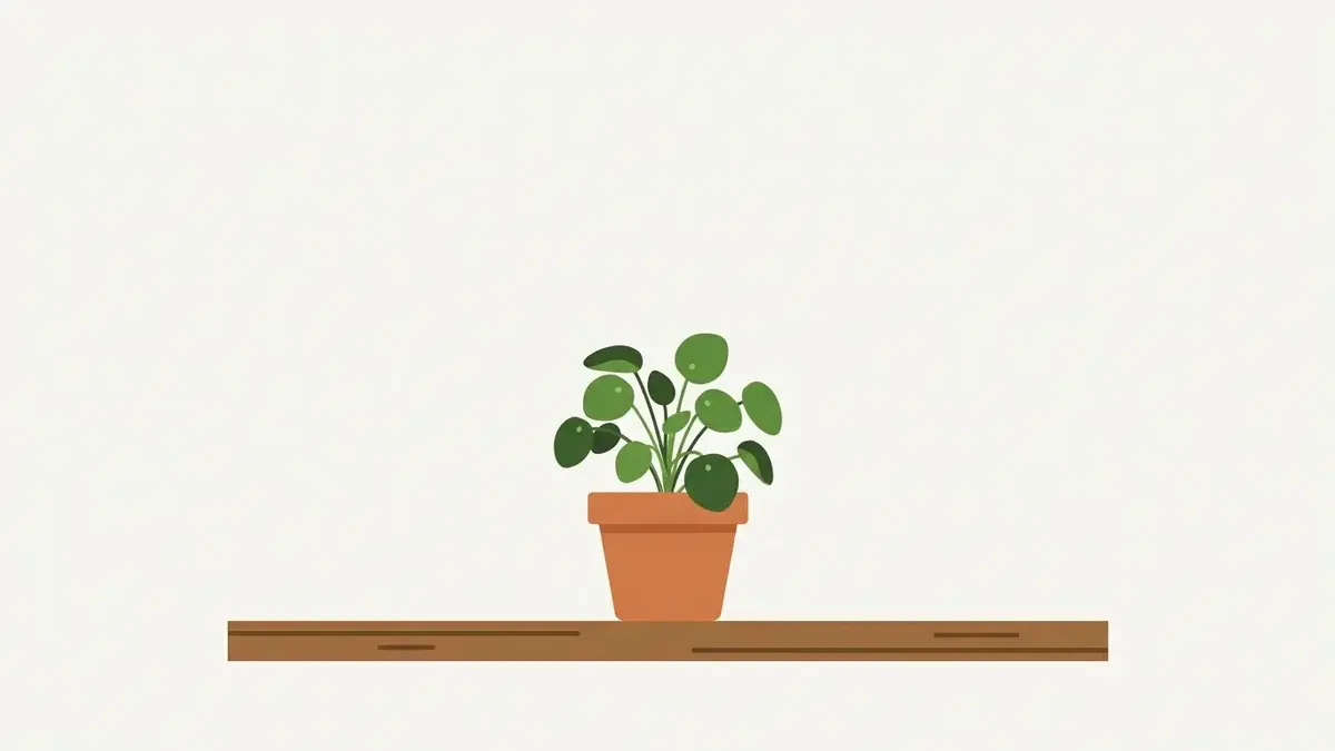
“[Your subject], [where it is or what it’s doing]. Flat illustration, flat color fills, matte finish, simple shapes, soft even light. Plain [your palette color] background. One wordless subject, centered, with wide empty space on every side.”
The first sentence changes with every image. Everything after it stays the same from post to post.
Keep the finished recipe somewhere you already look, like the notes doc you open for every post. That way it’s in front of you each time you sit down to make images, whichever tool you end up using.
The worry that readers will spot your images as AI is a reasonable one. Readers and bloggers say an AI-looking header makes them doubt the writing underneath. That’s something people report rather than a measured effect, but it’s enough reason to care, and a consistent house style plus honest alt text make an image read as a choice you made.
There’s a real tradeoff here. Flat styles look plainer than photorealistic images, and you give up some richness by sticking to one. What you get back is a set of images that match each other from one post to the next.
Describe What You Want Instead of What You Don’t
Google’s guide for Imagen covers this for its separate negative prompt field: list what you don’t want in plain words, such as “wall, frame”, and leave out “no” and “don’t”. Most tools you’ll use don’t have that field, so the habit that works everywhere is describing the look you do want.
Here’s the fix on the line from the top of this post. “No gradients, no glossy textures” becomes “flat color fills, matte finish, plain off-white background.” Every word in the new version tells the generator what to make.
It also doesn’t depend on how a particular tool handles the word “no”, which is what keeps the recipe portable from one generator to the next.
Set the Size Before You Generate Anything
Every image you make for the page, the featured image and the in-post ones, is 1200 x 675 pixels (16:9), saved as WebP. This site uses that size for all of them, so there’s only one number to remember.
Set that shape before the image exists. Asking for 16:9 at the start is far easier than cutting a different shape down to it afterwards, when part of the picture goes in the crop.
In Wealthy Affiliate’s Artist, pick the shape from the size menu above the brief, and not every option is 16:9. Choose a 16:9 option before you make the image, and you won’t need to crop it in another tool later.
If an image ever does need a crop, do it outside the Artist, before you resize.
The pin is the exception. It isn’t an on-page image, and it has its own shape. Pins and social posts get their sizes from one master image cropped three ways, so this post sticks to the images on your page.
Run Your Recipe in Wealthy Affiliate’s Artist
If you followed older steps for Wealthy Affiliate’s Image Studio, the tool that does this job now is the Artist. It makes images in three ways: from Studio, from inside an article you’re writing, or when you ask Ace for one. In Studio, picking Image starts the Artist.
On the Image screen in Studio, the Artist writes its own brief for the image before it makes anything. Paste your recipe over that brief before you make the image.
I don’t leave the Artist’s version in place, because in one test its rewrite of my brief turned a shopfront into a house. The brief is where the look gets decided, so I want my recipe sitting there.
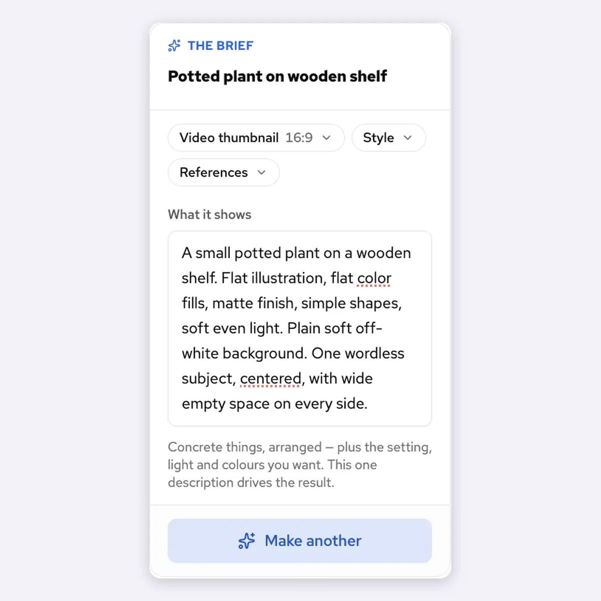
Inside an article, Suggest images proposes images for the post and Make all makes them. That’s the quick route when you want in-post visuals made right where you’re writing. The recipe-pasting steps above are for the Image screen in Studio.
What One Image Costs
Editing the brief costs nothing. Only making the image spends credits, and the Artist shows an estimate of the cost at the top of the screen before you make it. If the work fails, you aren’t charged for it.
There’s no fixed price per image type. Each image is charged at what it actually costs to generate, so two images of the same type won’t necessarily cost the same. Here’s one example, which isn’t a price: an article cover estimated at about 900 credits was charged 434. Estimates vary: the 16:9 image in the screenshot above showed about 500.
The charge can differ from the estimate, and the Credits page only shows a total for each tool. So to see what one image actually cost, note the Artist’s total on the Credits page before and after you make it. My Wealthy Affiliate review covers what a credit buys across the rest of the platform, plans included.
If you’re not a member yet, Starter is free with no card, includes every tool and comes with 4,000 one-time credits that never expire, and it isn’t a trial. Wealthy Affiliate’s own pricing page puts that at your first few pieces, and Ace’s replies come out of the same balance, so plan your images before you spend it.
The recipe, the Squoosh steps and the alt text steps further down all work with any generator, so you can run the whole workflow before deciding whether the Artist is worth your credits.
When Another Generator Makes the Better Image
The Artist isn’t always the best image maker, and you don’t have to treat it as if it were. Three questions decide which tool gets a particular image:
- Does the image need to be made where you’re writing the post? If it does, that points to a tool that works inside the article.
- How much does this one image carry? The featured image carries the most, because it loads first and, on most WordPress sites with an SEO plugin, it’s the picture people see when the post is shared.
- Would you rather spend credits, or the time it takes to switch tools? Both are real costs, and which one you’d rather spend changes the answer.
On a recent featured image, I tried the Artist, Google Flow and ChatGPT, and ChatGPT gave the best result of the three.
The Artist’s real advantage is that it works inside the article, so in-post images get made where the post is written.
So why spend credits when you could use a generator you already have? Sometimes you shouldn’t. The recipe goes wherever you go, and another tool may well give you the better featured image. The Artist earns its credits through convenience inside the article rather than by winning every comparison.
Which way to go depends on what you’re making:
- Building inside Wealthy Affiliate and making in-post images: use the Artist from the Image screen in Studio, because that’s where your recipe replaces its brief and keeps your in-post images matching.
- One image carries the post, usually the featured image: run your recipe in a second generator too, and keep whichever result looks more like your site.
Resize, Compress and Describe Each Image Before You Upload
Every image goes through the same finishing steps before it’s uploaded, and none of them needs design skill. I do the first two in Squoosh, which runs in your browser and keeps the images on your device:
- Resize to 1200 x 675, so the file isn’t carrying pixels the page will never show.
- Export as WebP to bring the file size down.
The reason for WebP is in Google’s WebP figures: lossless WebP files are 26% smaller than PNGs, and lossy WebP files are 25 to 34% smaller than comparable JPEGs at equivalent quality. Google built the format, so those are the maker’s own measurements.
Lossless keeps every pixel exactly as it was. Lossy drops detail your eye is unlikely to miss, which is how it gets files much smaller.
On one real AI image, a 6.41 MB PNG came out of Squoosh as a 141 KB WebP at quality 80. That drop is far beyond Google’s averages, and it isn’t typical. The original was a lossless PNG straight from the generator and quality 80 is lossy, so the comparison isn’t like-for-like.
Keep every image on the page under 200 KB, and aim nearer 100 KB for the featured image as long as it still looks sharp, because it’s the first image to load. That’s this site’s own rule.
The reason behind it comes from Google’s image SEO guidance, which notes that images are often the largest contributor to a page’s size.
Name each file in a few short lowercase words joined by hyphens, like niche-filters-flat-illustration.webp. Google treats the file name as a light clue to what the image shows, so it’s worth a few seconds and no more.
Write Alt Text a Screen Reader Can Use
Alt text is what a screen reader reads out in place of the image, so write it for the person listening. The W3C’s alt decision tree starts from what the image does. A purely decorative image gets an empty alt, and an informative one gets a short description of what it shows.
A diagram whose points are already in your text can take an empty alt, and one that carries information the text doesn’t should have that information written out on the page.
Google’s guidance points the same way. Alt text should be useful in the context of the page, and stuffing it with keywords makes for a poor experience and can come across as spam. The alt box describes the image. It isn’t a second place for your keyword.
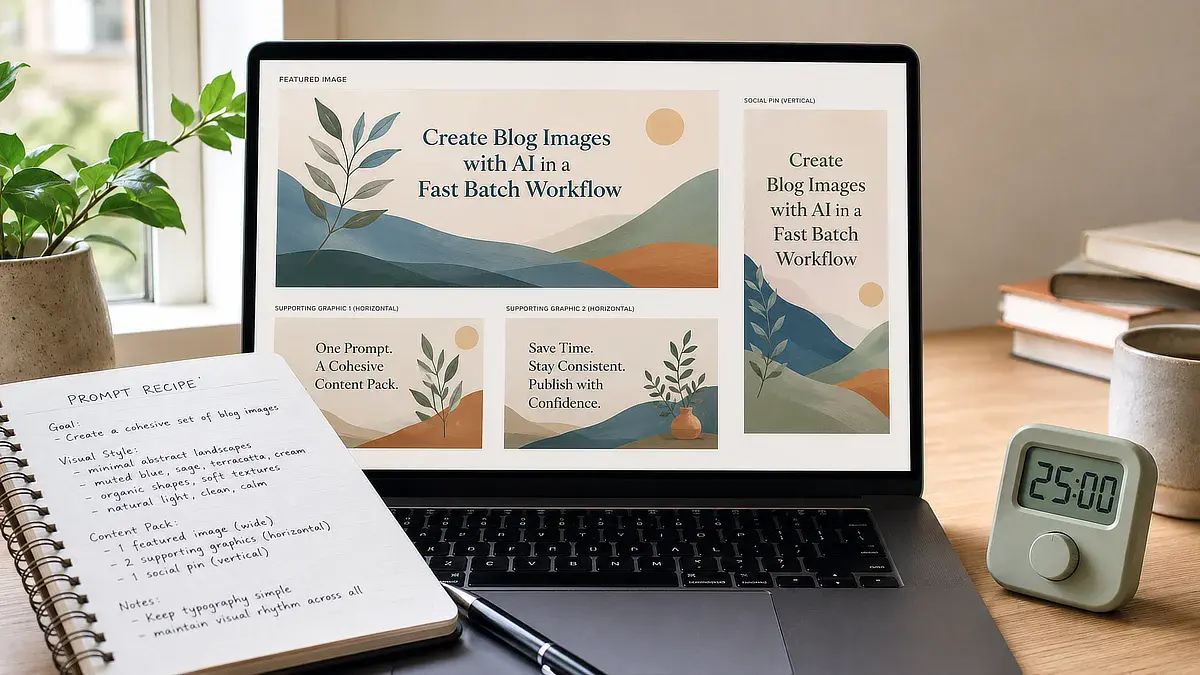
Here’s the difference on this post’s own featured image:
- Before: how to create images for blog posts, AI blog images, featured image
- After: Laptop showing a set of matching blog graphics, beside a notebook and a timer
Start with the recipe. Write your style words, your background color and your wordless-subject line into the notes doc you’ll keep them in, then use them to make the three images for the next post you publish, sized, compressed and described the way this section lays out.
Which style words finally made your images look like your site, or which “no” line are you rewriting as a positive description? Tell me in the comments. I read and reply to every one.
Sonia Zannoni
Hi, I’m Sonia Zannoni, creator of Click to Prosper. I share practical tools, workflows, and honest guidance to help you build an online business with more clarity and less chaos.
About Sonia
Feeling stuck between too many tools and too much advice? Start with the beginner path.
View the Blueprint