Why Your Affiliate Site Looks Amateur, and the Design Decisions That Fix It

Open your homepage in one tab and the site outranking you in the next. Flick between them.
The difference hits in under a second, and you can’t name a single thing that causes it. Yours looks like a site someone is still building. Theirs looks like a business.
That’s not a taste problem, and it’s not a skill you’re missing. You’re looking at a page of settings nobody ever told you to change, which is a different problem with a much shorter fix.
It’s also why searching affiliate website design for beginners probably didn’t help. You got eight-step guides to building a site you already have. Your question was never how to make an affiliate site. It’s why yours looks like that, and what to change.
So here’s the answer. Five decisions, each one made for you with the reason attached, each one sitting in a specific panel of the WordPress Customizer. All of it is reversible, all of it fits in one evening on the free theme, and none of it needs a purchase or a page builder.
TL;DR: Affiliate Website Design for Beginners
Every one of these lives in the Customizer on the free theme, and every one can be undone.
Your Site Does Not Look Amateur Because You Have Bad Taste
Start with what a default theme actually is. It isn’t a design. It’s a set of decisions the theme author deferred to you: which colors, which fonts, how wide, how many menu items. Every one you leave unmade shows, and together they read as provisional rather than plain.
That’s why an uncustomized site looks unfinished instead of minimal. Minimal is a choice somebody made. Default is a choice nobody made, and visitors can tell the difference even when they can’t explain it.
Your worry about this is well founded, too, because it’s a trust worry, not a vanity one. In Stanford’s research on how people evaluate a website’s credibility, 46.1% of the comments participants made about the sites they judged pointed, at least in part, to the look of the overall visual design: layout, typography, font size and color schemes.
That study ran in 2002, and the web looks different now. Later research points the same way: a 2006 study published in the journal Behaviour and Information Technology found people form a judgment of a page’s visual appeal in about a twentieth of a second, well before they could have read a word of it.
The usability researchers say the same thing from the practitioner side. Nielsen Norman Group’s four credibility factors include design quality, and they note that small mistakes chip away at credibility because they signal a lack of attention to detail. A page of untouched defaults is exactly that signal, repeated across every screen.
On an affiliate site, that signal has a price. At least one affiliate management agency, JEBCommerce, says it sees “hundreds of applications with the default WordPress theme and no content,” and it lists under-construction pages among the reasons it turns applications down.
A site that looks unfinished is starting that review at a disadvantage. So the vague embarrassment you feel looking at your homepage is really a cost you can check, and one you can remove.
Look at enough beginner affiliate sites and the same handful of defaults keeps showing up, almost in the same order. It’s rarely the theme itself, so your first instinct, that the other site bought a better theme, is usually wrong. If you want that question settled properly, here’s what a paid theme actually changes, and what it does not. For this post, it’s off the table.
It isn’t that the other site was designed. It’s that somebody sat down and made five decisions.
The Two-Minute Test That Tells You What Is Actually Wrong
Before you change anything, you need a way to judge your own site. “Does this look professional?” can’t be answered. You’ll stare at it until it looks fine or until it looks hopeless, depending on your mood. A count can be answered.
So open your homepage and one article page, and count these five things:
- Fonts. How many different typefaces can you spot, including the menu and the buttons? More than two is too many.
- Colors. How many distinct colors appear, not counting photographs or lighter tints of your text color? More than three, plus white, is too many.
- Line width. On a desktop screen, does a line of body text run from one side of the browser window to the other? If it does, the content area is too wide.
- Menu items. Can you read the whole header menu in one pass, without it wrapping to a second line or your eyes going back to the start? If not, it’s too long.
- Buttons. Does every button on the site share the same color, shape and text style? If you find two different treatments, that’s one too many.
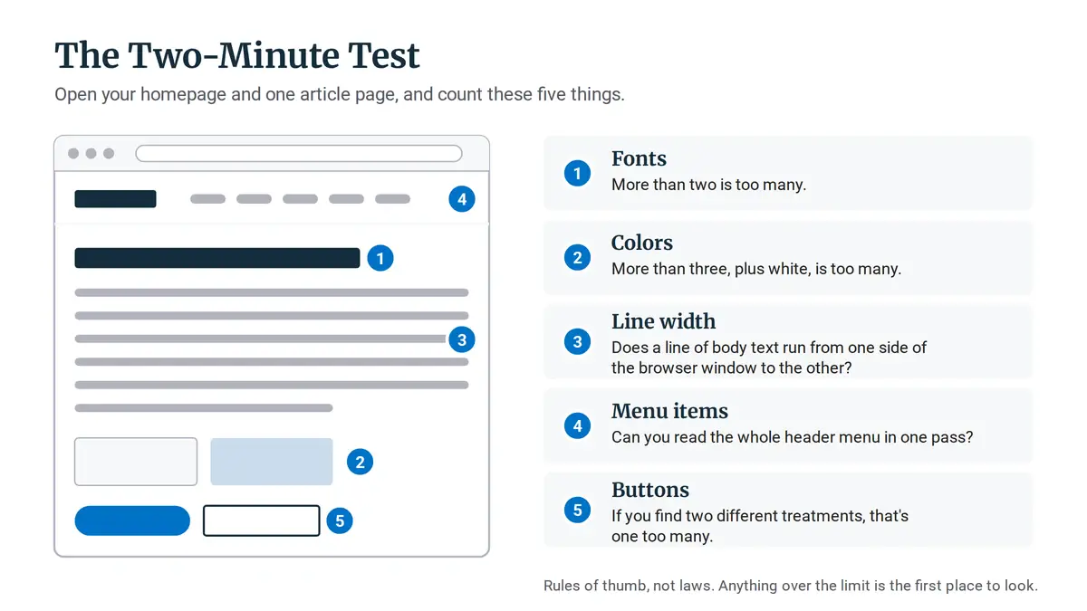
Anything over the limit is the first place to look. These limits are rules of thumb, not laws, but they turn a vague feeling into something you can count and change.
And here’s the good part. Everything below lives in one place: from the WordPress Dashboard, go to Appearance, then Customize. The panels you’ll use are Colors, Typography and Layout (which holds Container, Header, Primary Navigation and Sidebars), with the menu itself set in the Customizer’s Menus panel.
The walkthrough follows the free GeneratePress theme, which is one of the many themes Wealthy Affiliate includes, so if your site lives there and runs it, the panels will match.
Nothing here needs code, and nothing is permanent until you hit Publish in the Customizer. Before you change a setting, take a screenshot of the panel, so putting anything back is a two-minute job rather than guesswork.
Decision One, Pick Three Colors and Set Them Once
Here’s the call: three colors. A near-black for your text, one accent color for links and buttons, and a very light neutral for section backgrounds. That’s the palette for the whole site.
Color is how a page tells the reader what matters. When one thing is colored, it gets noticed. When five things are colored, nothing stands out, and the reader takes the page in as decoration rather than as a set of priorities. That’s why adding colors makes a site look less finished, not more designed.
Set this in the Colors panel, using Global Colors. It lets you define the palette once, and every element that uses it inherits the change.
GeneratePress starts you with seven swatches: three Contrast colors for text and borders, three Base colors for backgrounds, and one Accent.
Set Contrast to your near-black, Accent to your accent and Base to your light neutral. Then set Contrast 2 and 3 to lighter tints of your near-black, and Base 2 and 3 to white or your neutral, so nothing on the page pulls in a fourth color.
Click Publish and watch the whole site shift in one go. That’s usually the moment the evening starts to feel short instead of daunting.
Now, the brand worry. You might be thinking a three-color site will look like everyone else’s. It’s a real tradeoff, and I won’t pretend otherwise: a distinctive palette can make a site more memorable.
But distinctive and trustworthy aren’t the same thing, and in the make-money-online niche, where your reader arrives expecting to be sold something, restraint is the safer bet.
Who should deviate? If you already have an established logo with its own color, make that your accent and keep the other two neutral. If your niche is highly visual and your audience expects color, say a crafts or kids’ activities site, you might carry a second accent, used only in images, never in text.
Once the palette exists, it does a second job. The images you make for the site from now on can sit inside it instead of fighting it. If you want to build the image set around the colors you just chose, that’s covered in its own post. Here, the three colors are the whole decision.
Decisions Two and Three, Two Fonts and a Text Column Narrow Enough to Finish
Two fonts, at most. One for headings, one for body text, set in the Typography panel. You don’t need to learn anything about typographic scales to get this right. You just need to stop the page from mixing four typefaces the theme, a plugin and a pasted snippet each brought along.
The reason is the same as with color. A second font signals “this is a heading.” A third, fourth and fifth signal nothing except that nobody chose. Pick a readable body font first, since it carries most of the page, then a heading font that’s clearly different in weight or style.
Then the decision nobody thinks of, and the one that does the most work: how wide your text runs. On a desktop screen, a line of body text shouldn’t stretch across the full browser window.
Here’s why it matters. When a line is very long, the eye has to travel all the way back to the left edge at every line break, and it loses its place. The reader rereads a line, skips one, then gives up somewhere in the middle of your article. That’s reading mechanics, not taste, and it’s why a fix that looks cosmetic affects whether people finish your posts.
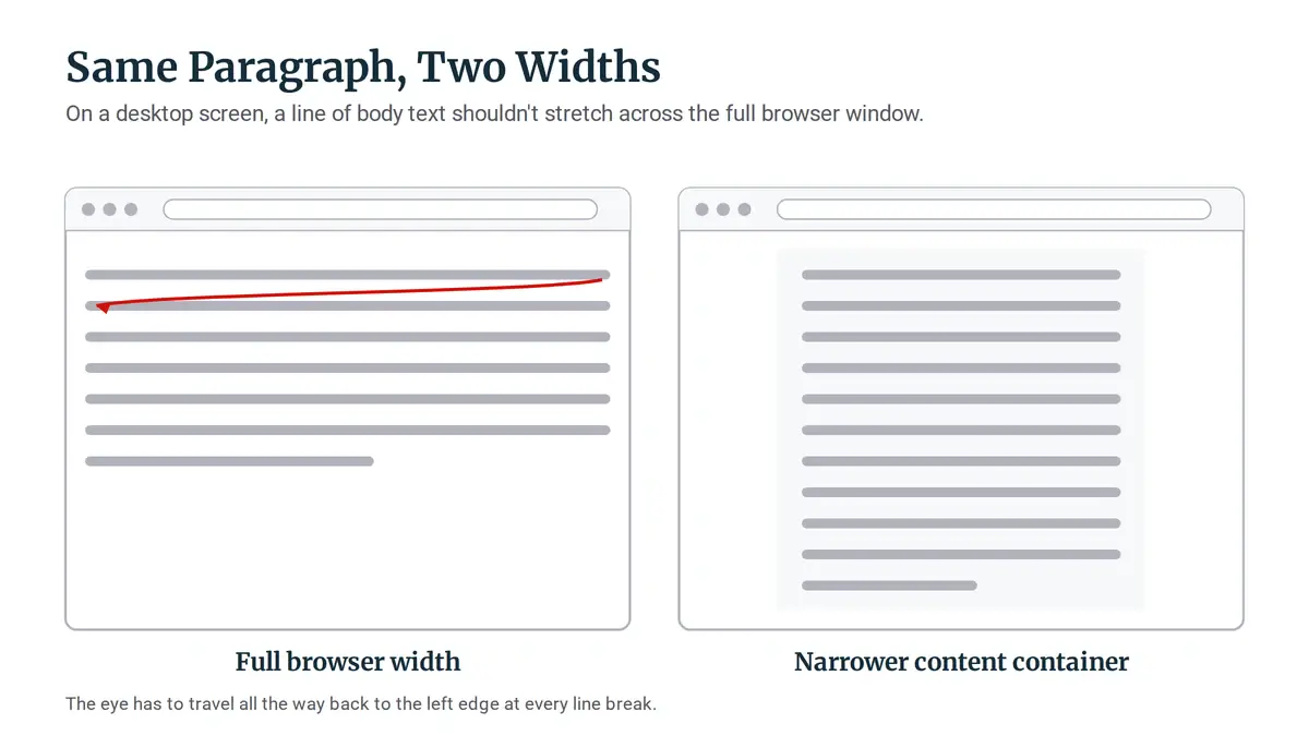
You’ll find this under Layout, then Container, which controls the content width. Bring the width in until a line of body text sits comfortably in the middle of a laptop screen, with clear space on either side, and check it on an article page, not just the homepage.
If you’re wondering about a sidebar, treat it the same way: as a question of how busy the reading area feels. A sidebar packed with widgets competes with the article for attention, so if you keep one, keep it quiet. The Sidebars settings sit right next to Container, under Layout.
Decisions Four and Five, One Button Style and a Menu Short Enough to Read
Buttons first. Pick one style and use it everywhere. A site with three different button treatments looks assembled from tutorials, because that’s usually exactly what happened: one from the theme, one from a plugin, one from a page someone copied.
Unlike most design questions, this one has a standard you can check rather than an opinion. Normal-size text needs a contrast ratio of at least 4.5:1 against its background. Large text needs at least 3:1, where large means roughly 18.5px in bold, or 24px at normal weight.
Contrast ratio just means how much darker one color is than the other. You don’t have to work it out: paste your button color and text color into a free contrast checker, such as WebAIM’s, and it tells you whether the pair passes. A pale accent color on white usually fails that test, which is why so many beginner buttons look washed out.
Set the button colors in the Colors panel, and if your accent fails, darken it rather than making the text smaller. That setting styles the theme’s own buttons. A button added by a plugin or a block keeps its own styling, so if the test turned up a second style, find where that button came from and either set it to match or remove it.
What the button should say and how loud it should be depends on your site. A review-heavy site is asking readers to leave and click through to a merchant, so its buttons can afford to stand out. A tutorial-heavy site mostly wants readers to keep reading, so its buttons can be quieter, closer to a strong link. Same style everywhere, either way.
Then the header. The menu should carry the few things a reader would actually use, not everything that exists. Its look is handled under Layout, in Header and Primary Navigation, and which items it holds is set in the Customizer’s Menus panel.
With four posts, you might need nothing more than Home, a single topic page and About. With forty, a handful of main categories plus About makes sense, and everything else can live in the footer.
Deciding which categories exist in the first place is a different job, and if you’re not sure yours are right, start with a header menu the reader can actually scan. This post only covers how many items belong up top and how they look.
The Two Questions That Stop People Changing Anything
Two worries tend to stop people right here, even after they’ve run the test and seen the numbers. Both are reasonable. Both have short answers.
“If it’s this simple, why does everyone tell me to buy a theme?” Mostly because that advice is written for someone who doesn’t have a site yet. It’s the first step in a guide that routes you to a host or a builder.
You already have a site. Your problem isn’t which theme you picked. It’s that the decisions inside it were never made.
“Will changing my fonts and colors hurt my rankings?” Changing your colors and fonts won’t. They don’t touch your words, your headings or your URLs. What does put rankings at risk is gutting a post, changing a URL, or rewriting the section that answers the search query, and none of those are on tonight’s list.
The one item on tonight’s list that does touch what search engines read is the menu, because header links help Google find your pages. So move the items you cut into the footer rather than deleting them. Keeping to two fonts has a side benefit, too: fewer font files for each page to load.
So the paid theme isn’t what separates a finished site from an unfinished one. The difference is decisions, and on the free theme those cost nothing.
What to Change Tonight, and What to Leave Alone
Work in this order: palette, then fonts, then content width, then buttons, then the menu. The order matters because each decision makes the next one easier to judge. The palette decides what color your buttons can be. The width decides how your body font actually reads.
Here’s the whole evening as a checklist you can work down, one row at a time.
Decision
The default that reads unfinished
What to set instead
Where it lives in the Customizer
Colors
Theme colors plus extra ones added per element
A near-black for text, one accent for links and buttons, one light neutral for backgrounds
Colors (Global Colors)
Type
Several fonts from the theme, plugins and pasted content
One font for headings, one for body text
Typography
Content width
Body text running the full width of the browser
A narrower container, so lines end well before the screen edge
Layout, then Container
Buttons
Different colors and shapes from different sources
One button style, with text at 4.5:1 contrast or better
Colors (buttons)
Header menu
Every page and category added to the menu
Only the few items a reader would actually use
Layout (Header, Primary Navigation), plus Menus
Colors
The default that reads unfinished: Theme colors plus extra ones added per element
What to set instead: A near-black for text, one accent for links and buttons, one light neutral for backgrounds
Where it lives in the Customizer: Colors (Global Colors)
Type
The default that reads unfinished: Several fonts from the theme, plugins and pasted content
What to set instead: One font for headings, one for body text
Where it lives in the Customizer: Typography
Content width
The default that reads unfinished: Body text running the full width of the browser
What to set instead: A narrower container, so lines end well before the screen edge
Where it lives in the Customizer: Layout, then Container
Buttons
The default that reads unfinished: Different colors and shapes from different sources
What to set instead: One button style, with text at 4.5:1 contrast or better
Where it lives in the Customizer: Colors (buttons)
Header menu
The default that reads unfinished: Every page and category added to the menu
What to set instead: Only the few items a reader would actually use
Where it lives in the Customizer: Layout (Header, Primary Navigation), plus Menus
Now the other half, which is what keeps this to one evening.
Leave your existing images alone. Don’t go back and regenerate every featured image to match the new palette. New images simply get made inside it from now on, and if you use AI tools for that, here’s how to keep generated images from fighting your site palette.
And don’t try to fix appearance by installing plugins. It’s the most tempting trap on this list, because a new plugin feels like progress. It usually adds another font, another button style and another set of colors, which is the problem you’re trying to remove.
Before you add anything, check the plugins worth keeping, and the ones your theme already replaces.
You don’t need to finish all five tonight to see the difference. Open Appearance, then Customize, set your Global Colors, click Publish, and look at your homepage again before you close the laptop. It’s the shortest change on the list, and the one you’ll notice first.
When you ran the two-minute test, which came out worst, the color count or the menu? Tell me in the comments. I read them, and I reply.

Sonia Zannoni
Hi, I’m Sonia Zannoni, creator of Click to Prosper. I share practical tools, workflows, and honest guidance to help you build an online business with more clarity and less chaos.
About Sonia
Feeling stuck between too many tools and too much advice? Start with the beginner path.
View the Blueprint