How to Create Blog Images for Pinterest and Facebook with One Reusable Visual System

Here is the mistake almost nobody notices they are making: opening a blank canvas three separate times for one article. One for the blog header, one for the pin, one for the Facebook post. Three layouts, three font decisions, three color choices, and by the third one you are just picking whatever looks fine so you can go to bed.
If making blog images for Pinterest and Facebook feels like three unrelated design jobs bolted onto the end of writing, that reaction is fair. Squeezing a horizontal blog banner into a vertical pin always cuts the subject in half, and stretching a square into the Facebook feed leaves grey bars on either side.
The fix is not becoming a designer or paying for a resize button. It is one master image and three fixed templates you build once. Below are the exact dimensions each platform wants, how to compose a visual that survives all three crops, and how to assemble the full set in about fifteen minutes.
TL;DR: The One Visual System Workflow
Why Squeezing One Graphic Across Three Platforms Never Works
Each of these three places wants a different shape, and the shapes are not close enough to fake. A blog header sits inside a content column on a desktop screen, so it wants landscape, usually 16:9.
Pinterest is a vertical search feed viewed almost entirely on phones, so it wants tall. Facebook’s mobile feed rewards portrait images that hold more screen height as someone scrolls, and it builds a separate wide card when you share a link instead of uploading a picture.
So when you push the same 16:9 header to Pinterest, one of two things happens. Either the platform pads it with empty bands above and below, which makes the pin look like something went wrong, or it crops the sides and takes half your subject with them.
Text overlays suffer worst, because a headline sized for a wide banner shrinks past legibility once the same file is scaled into a narrow phone feed.
That is not a resolution problem. It is a shape problem, and no export setting fixes a shape problem.
The other route is worse. You open three blank files, design each one on its own, and end up with three graphics that share no fonts, no color, and no structure.
Someone who sees your pin on Monday and your Facebook post on Thursday has no reason to connect them to the same site, and you paid for that disconnect with an hour you did not have.
Automatic resize buttons are not useless here; they are just working with the wrong input. They take a finished layout and stretch it into a new frame, which slides your text off the subject and leaves you repositioning everything by hand anyway. The tool is not the problem. Handing it a finished layout instead of a raw image is.
Which points straight at the fix: stop making finished graphics, and start making one raw asset plus three frames.
The Master Visual Rule: Separate the Image from the Layout
Here is the rule the whole system rests on. Never burn a headline, a post title, or your domain into the primary image file. The moment text lives inside the picture, that file is locked to one aspect ratio permanently, because any crop that changes the shape also chops the words.
So keep two things apart: the picture, and the layer of text sitting on top of it. The picture is your master asset, exported once at the largest size you will need. The text belongs to the template, gets added per platform, and gets thrown away the moment you change your mind about the headline.
Compose the master with the subject near the middle and real breathing room on all four sides. A vertical crop eats the left and right edges. A landscape crop eats the top and bottom.
Anything you actually need the reader to see has to survive both, so a detail sitting near an edge is going to disappear in at least one of the three frames.
Conceptual images survive this better than literal ones. A single object, a simple scene, one clear focal point: those crop in any direction and still read at thumbnail size.
A three-column dashboard screenshot does not, because its meaning lives in the layout, and cropping the layout removes the meaning. Screenshots belong inside the body of the post where you control the width, not in your social frames.
If you are generating the master rather than sourcing it, the simple AI image-creation workflow produces exactly this kind of asset: one clean subject, no text, room around the edges.
Purpose-built creator tools come at the same problem from the other side. A creator platform built for consistent visual assets is aimed at keeping a character or a style stable across a run of images, which matters if your visuals lean on a recurring look.
It is useful, not required. The system in this post works with whatever produces a clean, text-free picture.
Before you settle on a source, decide what the image has to survive. Full width on a desktop monitor, where detail shows. A phone-sized pin in a feed moving under someone’s thumb, where only shape and contrast register.
An image that works at one of those two sizes and not the other is not a master image; it is a single-use graphic.
Once the picture is text-free and centered, the rest is just measurements.
The Three Fixed Ratios and Why Their Boundaries Matter
These are not style preferences. Each platform renders inside a fixed frame, and anything outside that frame gets padded or cut. Here is what each of the three assets needs, plus the fourth one Facebook builds for you whether you plan for it or not.
Platform / Asset
Recommended Pixel Dimensions
Aspect Ratio
Primary Role and Safe Zone Notes
Blog featured image
1200 x 675 px
16:9
Desktop and mobile post header. Keep key elements centered so responsive edge cropping does not remove them.
Pinterest standard pin
1000 x 1500 px
2:3
Vertical feed pin. Bold hook in the upper third, and stay under a 1:2.1 height or the feed cuts the bottom.
Facebook mobile feed post
1080 x 1350 px
4:5
Native uploaded image. Tallest portrait the mobile feed shows without cropping or letterboxing.
Facebook link share (OpenGraph)
1200 x 630 px
1.91:1
Auto-generated preview card for a shared URL. Keep text and logo centered against peripheral trimming.
Blog featured image
Recommended Pixel Dimensions: 1200 x 675 px
Aspect Ratio: 16:9
Primary Role and Safe Zone Notes: Desktop and mobile post header. Keep key elements centered so responsive edge cropping does not remove them.
Pinterest standard pin
Recommended Pixel Dimensions: 1000 x 1500 px
Aspect Ratio: 2:3
Primary Role and Safe Zone Notes: Vertical feed pin. Bold hook in the upper third, and stay under a 1:2.1 height or the feed cuts the bottom.
Facebook mobile feed post
Recommended Pixel Dimensions: 1080 x 1350 px
Aspect Ratio: 4:5
Primary Role and Safe Zone Notes: Native uploaded image. Tallest portrait the mobile feed shows without cropping or letterboxing.
Facebook link share (OpenGraph)
Recommended Pixel Dimensions: 1200 x 630 px
Aspect Ratio: 1.91:1
Primary Role and Safe Zone Notes: Auto generated preview card for a shared URL. Keep text and logo centered against peripheral trimming.
That fourth row is the one people forget. When you paste a link to your post on Facebook instead of uploading an image, Facebook ignores your pin and your portrait graphic entirely.
It reads the Open Graph image tag on your page, which an SEO plugin like Rank Math fills in from your featured image automatically, and renders that as a wide card. Which means your 16:9 blog image is quietly doing double duty as a link preview, and on a site with no plugin handling that tag, Facebook picks whatever it finds instead.
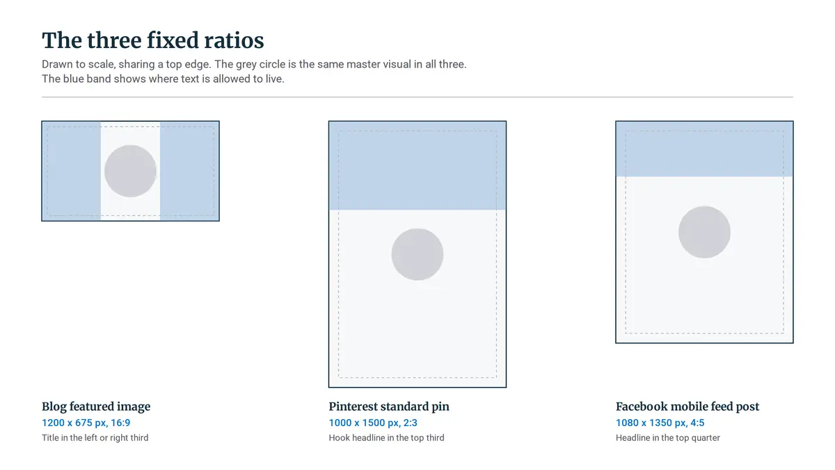
Pinterest’s standard is 1000 x 1500 pixels, a 2:3 ratio, and the ratio matters more than the pixel count. Taller pins used to claim more feed space, until Pinterest started truncating them. Past roughly a 1:2.1 height, the feed slices off the bottom of the pin, which is exactly where most people put their call to action and their domain name.
Hootsuite’s social media image size guide tracks these limits across platforms and is worth a bookmark, because they do move.
Facebook’s native feed post performs best at 1080 x 1350 pixels, a 4:5 portrait. That is the tallest image the mobile feed will display without cropping it, so it holds more of the screen as someone scrolls past.
The 1200 x 630 card at roughly 1.91:1 is a different asset for a different job, the one a shared link renders as, and Meta’s business help documentation is where to confirm both, since feed rendering changes more often than anyone announces.
For the blog itself, 1200 x 675 pixels at 16:9 is the workhorse. Export it as WebP and keep the file light, ideally under 100 KB, because the featured image is usually the largest thing on the page and it loads first.
That usually makes it the element Google measures for Largest Contentful Paint, the loading speed score that feeds into Core Web Vitals. A 900 KB hero image is a real speed cost on a post you already worked hard on.
Three numbers, then. Build the frames once, and you never look them up again.
Building Your Three Canvas Templates in Free Tools
You do not need a paid plan for this. Canva’s free tier lets you create a custom-size canvas, and Photopea does the same in a browser with no account at all. Make three blank canvases at the three sizes above, then save each one as something you duplicate rather than a file you keep overwriting.
Before you place anything, lock the styling decisions so you never make them again mid-post:
- One display font for the hook, because a pin headline has about a second to be read on a phone and a delicate font loses that second.
- One secondary font for subtitles and the domain line, so the two never compete for the same attention.
- One accent color, pulled from your site’s actual palette rather than picked fresh each time, since matching your site is the entire point.
- A backing shape behind any text, solid or semi-transparent, because text sitting directly on a photograph becomes unreadable the moment you swap the photograph.
Then mark where text is allowed to live in each frame. The zones are different because the feeds are different:
- Blog template (16:9): title in the left or right third, or centered over a darkened overlay. Keep it off the outer edges, where responsive themes crop first on narrow screens.
- Pinterest template (2:3): hook headline in the top third, visual subject through the middle, small domain line at the bottom. Pinterest users read the top of a pin and keep scrolling.
- Facebook template (4:5): headline in the top quarter, image dominant below it. The caption carries the detail, so the graphic only has to earn the stop.
The obvious question is whether a paid auto-resize feature does all this for you. It moves your elements proportionally, which is not the same as moving them correctly, so a headline centered in a wide frame lands on your subject’s face in a tall one.
You end up repositioning by hand on every post, permanently. Three static templates cost you one evening and then stop asking anything of you.
With the frames built, the per-post work collapses into a short, boring routine. Boring is the goal.
The 15-Minute Cross-Platform Production Workflow
The point of the setup is that the weekly work becomes mechanical. Here is the run, once a draft is finished.
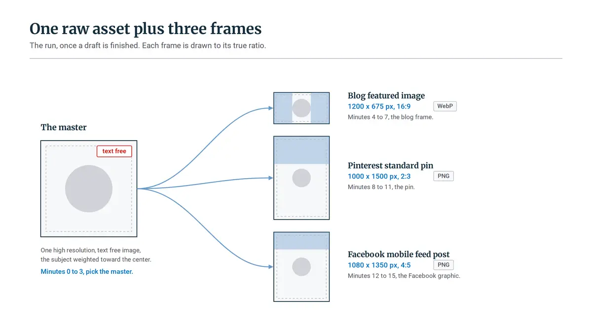
- Minutes 0 to 3: pick the master. Choose or export the single high-resolution, text-free image for this post. Check the crop tolerance now by imagining the left and right thirds gone, then the top and bottom gone. If the subject survives both, it is your master.
- Minutes 4 to 7: the blog frame. Open the 16:9 template, place the master, add the post title, and export. Photopea writes WebP straight out of the browser. Canva does not, so export a PNG there and run it through a free converter like Squoosh before you set it as the WordPress featured image. This one doubles as your Facebook link preview, so read the title at small size before you move on.
- Minutes 8 to 11: the pin. Open the 2:3 template, scale the master so the subject holds the middle, and write a hook that reads like something a person would search rather than something clever. Export as PNG.
- Minutes 12 to 15: the Facebook graphic. Open the 4:5 template, drop in the master, shift the headline into the top quarter, export as PNG, and save all three files in the same folder as the post.
Doing all three in one sitting is the part that actually saves the time. Split them across the week and you reopen the software, relearn where everything was, and make different choices than you made on Monday.
Assembling the set while the post is still fresh means that when you sit down for your weekly Pinterest batching routine, the images are already in the folder and scheduling is just scheduling.
Fifteen minutes is the steady state, not the first attempt. Building the templates and finding a master image that crops cleanly will take an evening the first time through. The routine gets fast because you spent that evening once.
Brand Consistency vs. Platform Adaptation: How to Keep Your Site Recognizable
The system holds together because most of it never changes. Same hex codes, same two fonts, same domain placement, same general mood on every graphic you publish. That repetition is the whole mechanism behind someone recognizing your pin in a crowded feed before they have read a word of it.
What does change is the sentence on top, because the three audiences arrived in different moods. Pinterest is a search engine, so the hook works best when it reads like something a person would type: a problem, a question, a specific outcome.
Facebook is a conversation feed, so the same post needs a line that sounds like a person talking rather than a headline. The blog header wants the actual article title, clear and descriptive, because it is also the card people see when your link gets shared.
The failure mode is grabbing a different trendy template every week because it looked good in the picker. Each one is fine on its own. Together they teach a reader nothing, because there is no pattern left to learn.
Visual identity works the same way a clear site category structure does: the value is not in any single decision; it is in the decision holding still long enough for someone to notice it.
So the next step is small. Open your graphics tool, build the three canvases at 1200 x 675, 1000 x 1500, and 1080 x 1350, drop in your site’s fonts and colors, and save them. Then test the routine on your very next post, before you have a backlog of graphics to redo. If the second run takes longer than fifteen minutes, the template is doing too much, not you.
One thing I am curious about: which one currently eats more of your design time, resizing vertical pins for Pinterest, or getting Facebook link previews to crop cleanly? Let me know in the comments below.
Sonia Zannoni
Hi, I’m Sonia Zannoni, creator of Click to Prosper. I share practical tools, workflows, and honest guidance to help you build an online business with more clarity and less chaos.
About Sonia
Feeling stuck between too many tools and too much advice? Start with the beginner path.
View the Blueprint